 Figure
2B-A
Figure
2B-A
![]()
Figure
2B-B
Figure
2B-C
Figure
2B-D
 Figure
2B-E
Figure
2B-E
Figure
2B-F
Figure
2B-G
| Text Basics |
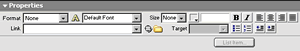
Most features on the Properties Inspector (Figure 2B-A and 2B-B) are obvious:
- Click on B to make your text bold
- Click on I to place your text in italics
- Click on the Align icons to align text
- Click on the button icon to make a list such as the one you are reading
- Click on the number icon to make a numbered list
- Click on the Indent icon to indent
- Click on the Outdent icon to outdent
| FONT TYPES |
Don't mess with a lot of fonts!
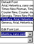
Use only the six options (or default) you get when you click the arrow next to font name.(Figure 2B-C).
Not all browsers can read all fonts. But all browsers can read these options.
Note: You will notice each selection has a list of three or four in succession. These selections are coded in such a way that if a browser cannot read the first font type, it will default to the next, and so forth.
| TIP: Verdana is a font specifically designed for reading on screen. Many people believe that Times New Roman looks great on a Newspaper, but is difficult to read on the Web. |
| FONT COLOR |
The best option for text that you intend to be read is black on white. Everything else is a compromise on style vs. readability.
If you use a dark background (such as the titles of these instructions), then use a light color text.
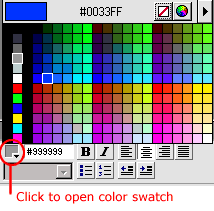
To change font color:
- highlight the text with the cursor
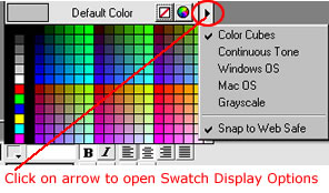
- click on the color icon (Figure 2B-D) to access the color cubes
- if you do not see the color cubes, click on the arrow (Figure 2B-E) and select Color Cubes.
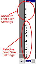
| FONT SIZE |
Everything is relative.
Remember: Users have the ability to change how they view font sizes.
You can make "absolute" font size settings. The so-called absolute settings are based on a default text size of 3 (in most browsers about 12 points). But usually, Best Practice is to use relative font sizes, especially if you want all your text to look basically the same to everyone.
To change font size,
- highlight the text
- click on the arrow next to "Size" on your Properties Inspector (Figure 2B-F)
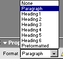
| FORMAT |
In most cases, you won't have to worry about the Format settings. When typing text on the page, DW automatically changes to the appropriate format.
It is a good practice to use the heading feature (Figure 2B-G) for titles and subheadings on your pages.